How to Create a Responsive Web Design

7 Amazing Features of Chat GPT-4 You Should Know
January 23, 2025
Future Trends in Web Design: What to Expect
January 24, 2025
Responsive web design makes websites look great on all devices. This includes desktops, tablets, and smartphones. A responsive design ensures your site adapts to different screen sizes. It improves user experience and keeps visitors engaged. Follow these steps to create a responsive web design.
1. Start with a Flexible Grid Layout
A grid layout divides the web page into sections. Use a flexible grid that adjusts to screen sizes. CSS Grid and Flexbox are tools to create layouts that adapt to any device. Define columns and rows that can shrink or grow.
Example:
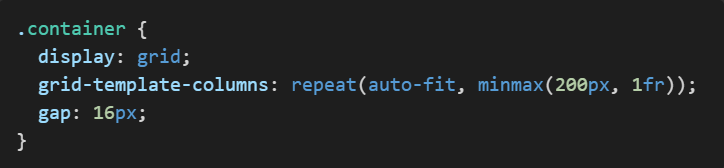
This example creates a layout that adjusts as per the screen width.
2. Use Media Queries
Media queries help customize styles for different devices. Set breakpoints where the layout changes. These breakpoints depend on device widths.
Example:
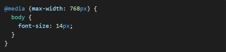
In this example, the font size changes for devices with a width of 768 pixels or less.
3. Make Images and Media Flexible
Images and videos should resize to fit the screen. Use CSS properties like max-width and height: auto.
Example:

This ensures images adjust their size without losing proportions.
4. Use Scalable Fonts
Set fonts in relative units like em or %. This allows fonts to scale based on screen sizes.
Example:
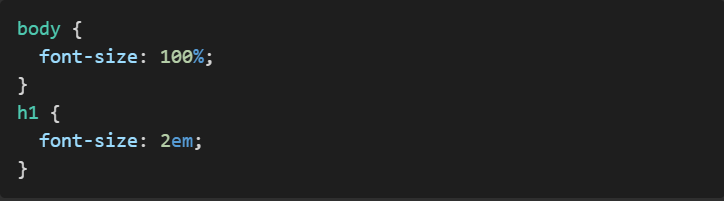
Relative units make text readable on all devices.
5. Optimize Navigation Menus
Menus should be easy to use on any screen. On smaller screens, use collapsible menus or hamburger icons.
Example:
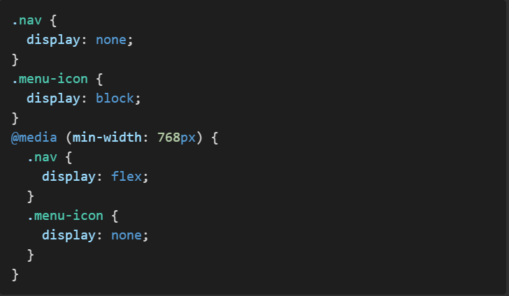
This approach switches between a menu icon and a full navigation menu.
6. Test on Real Devices
Testing ensures your design works as intended. Check your website on various devices and browsers. Tools like BrowserStack or real devices help identify issues.
7. Keep Load Times Short
A responsive design should load fast. Use optimized images, minified CSS, and JavaScript. A faster website improves user experience and search rankings.
8. Design Touch-Friendly Elements
Touch screens require larger, easier-to-tap buttons. Ensure enough space between interactive elements.
Example:
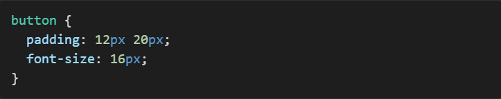
This makes buttons easier to tap on mobile devices.
9. Use Responsive Frameworks
Frameworks like Bootstrap or Tailwind CSS save time. They include pre-built responsive components and styles. You can customize them to match your design.
10. Regularly Update Your Design
Technology and devices change. Update your design to stay compatible with new standards. Regular updates keep your site user-friendly.
Creating a responsive web design improves your website’s usability and reach. It ensures visitors stay longer and engage more. Need a professional web design? Contact us today to get a custom website that works on all devices!

